Graphics & Art
-
![Colorful poster with the text 'Real Salt Lake' and a message about standing on your feet if you believe, featuring a red, blue, and yellow soccer ball, an outline of the state of Utah in red with a star and a lion's face in yellow.]()
This piece captures the emotion of supporter culture: pride, place, and belief. I wanted the design to feel loud and communal, using bold soccer imagery, Utah symbolism, and club-inspired color to create something that feels like it belongs in the stands.
-
![Illustration of barbershop tools including a barber pole, scissors, comb, straight razor, hairbrush, clippers, barber chair, and other grooming tools, with text reading "Styling, Color, & Haircut KS Hair Design."]()
This illustration was built around the personality of a creative service brand. By arranging familiar barbershop and styling tools in a clean, playful composition, I wanted to communicate both craft and approachability. The piece balances professionalism with warmth, giving the brand a visual style that feels personal, creative, and service-driven.
-
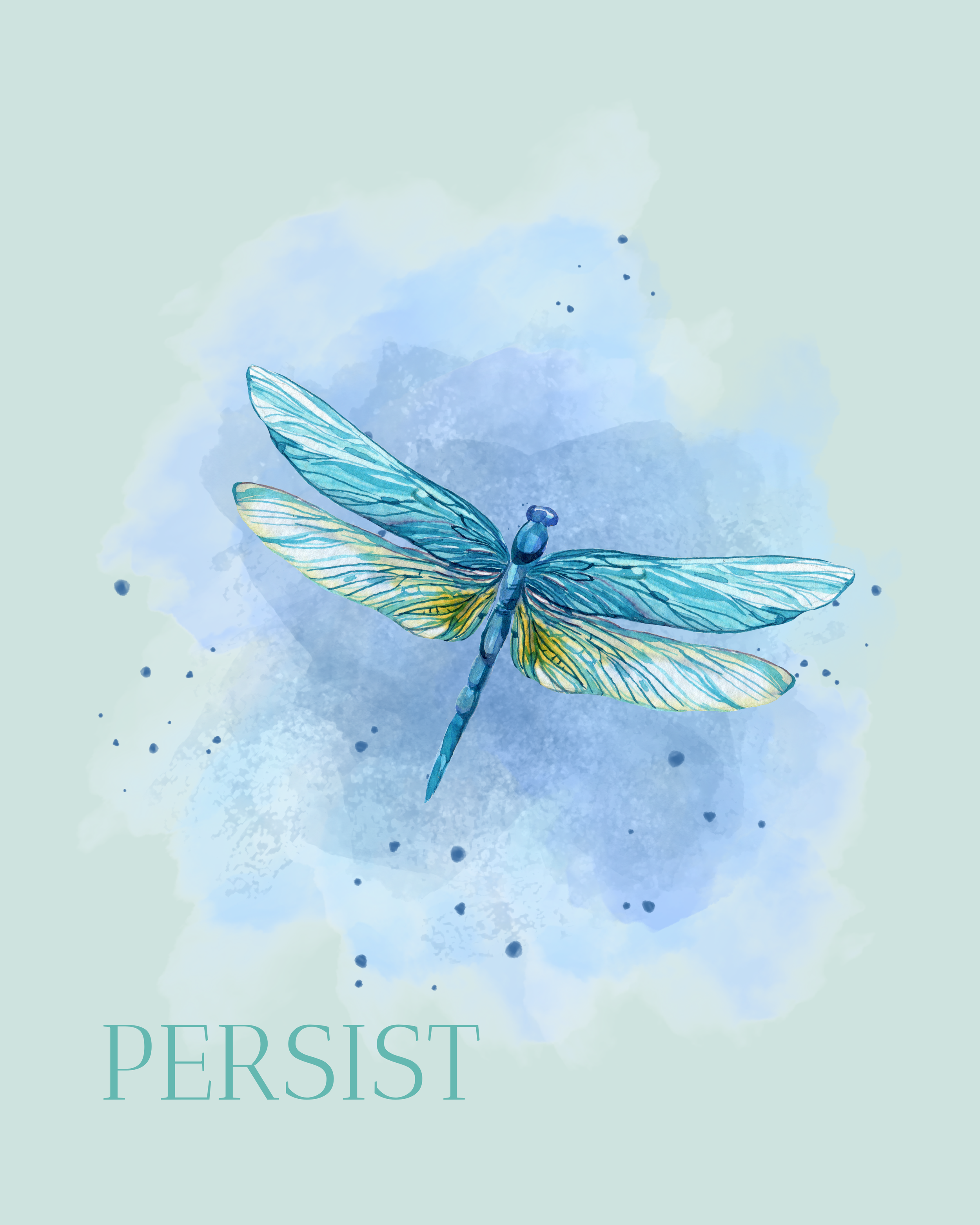
![A watercolor illustration of a blue and yellow dragonfly with the word "PERSIST" written below.]()
The dragonfly in this piece became a symbol of resilience, movement, and quiet strength. I used a watercolor-inspired style to give the design a softer emotional quality, allowing it to feel more reflective than forceful. The word “Persist” grounds the illustration with a clear message of endurance, reminding the viewer to keep moving forward even through difficult seasons.
-
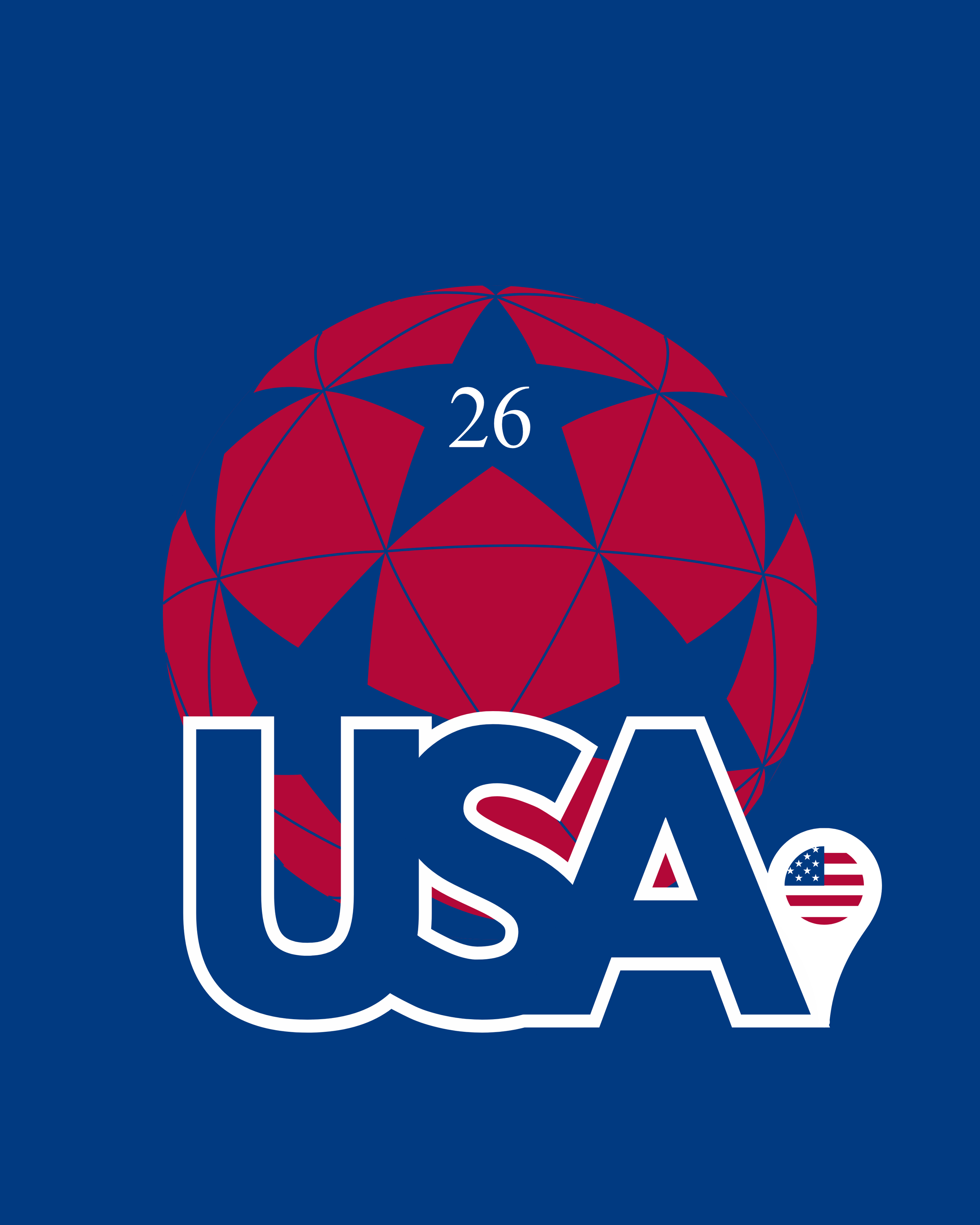
![Design featuring a blue background with a red and blue 3D globe, the number 26 inside a star at the top, and the word USA with an American flag in the 'A' at the bottom.]()
This fan graphic was created to celebrate the 2026 FIFA World Cup and the role of the United States as one of the host nations. I wanted the design to feel bold and energetic while still honoring the beautiful simplicity of the game. The ball, flag-inspired color, and clean tournament-style composition help connect national pride with the universal language of soccer.
-
![Design with a green background, featuring a geometric globe with connected white shapes and green stars, the number 26 inside a star at the top, and the word 'MEXICO' in bold red and white letters at the bottom, including the Mexican flag in the K of Mexico.]()
DescriptioThis piece celebrates Mexico’s place as a host nation for the 2026 FIFA World Cup. I wanted the graphic to feel vibrant and full of pride while keeping the focus on the simple beauty of the sport itself. The design uses color, geometry, and soccer imagery to symbolize both the energy of the tournament and the way the game connects people across cultures.n goes here
-
![Red background with a white geometric globe featuring stars and the number 26, and the word 'CANADA' with a Canadian maple leaf in a location marker icon.]()
Description gThis fan graphic was designed to represent Canada as a host nation for the 2026 FIFA World Cup. The composition is intentionally simple, using clear national symbolism and soccer imagery to reflect the beauty of the game without overcomplicating the message. I wanted the piece to feel clean, confident, and celebratory while still fitting within a broader tournament-inspired visual system.oes here
-
![Logo of the Mexico-United States-Canada Agreement, featuring a globe with stars and geometric patterns, with the words 'MEXICO,' 'USA,' and 'CANADA' written vertically in green, blue, and red.]()
DescriptionThis combined graphic brings the United States, Mexico, and Canada together as the three host nations of the 2026 FIFA World Cup. The goal was to symbolize the scale of the competition while also celebrating the beautiful simplicity of soccer: a ball, a field, a shared moment, and people from around the world coming together. By giving each country its own visual identity within one unified composition, the piece reflects both national pride and the global spirit of the tournament. goes here
-
![A group of five soccer players in purple jerseys standing on a soccer field with a stadium in the background. The text reads "We are the champions" and there is a shield emblem with the year 1925, a trophy icon, and the words "Phantom Cup Winner 2024" and "Phantom Football Federation."]()
This piece celebrates achievement inside a fictional football universe. I wanted the design to feel like a real championship graphic, using trophy symbolism, team identity, and sports-poster energy to make the moment feel important. Even though the league is fictional, the goal was to treat the visual language with the same seriousness and excitement as a real club competition.
-
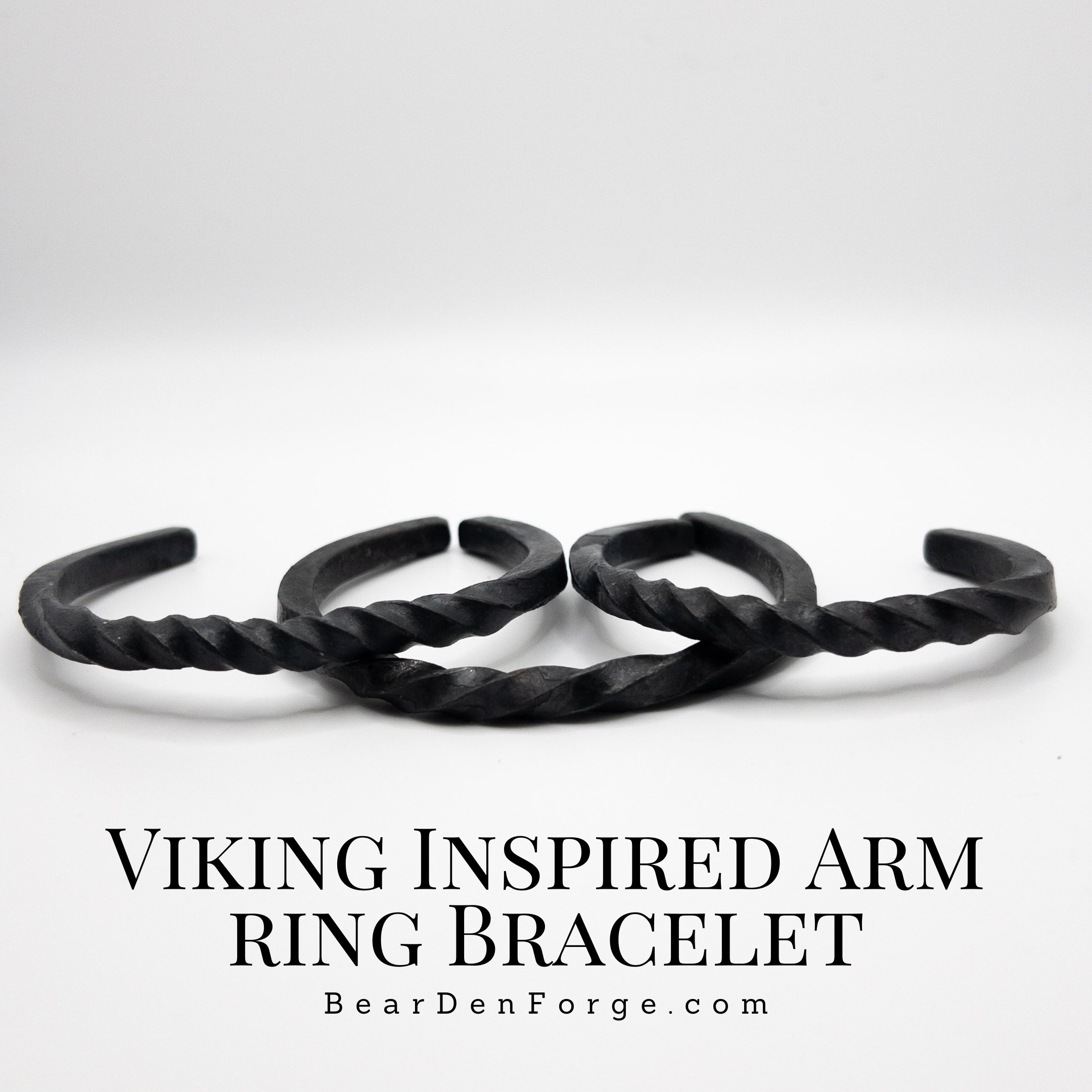
![Three Viking-inspired black arm ring bracelets with twisted design, displayed against a plain white background with text promoting them from BeardedEnForge.com.]()
This design focuses on presenting handcrafted products in a clean and compelling way. I wanted the bracelets to remain the visual focus, so the layout supports the product without overwhelming it. The typography, spacing, and overall composition were chosen to reinforce a rugged, handmade brand personality while still feeling polished enough for advertising.
-
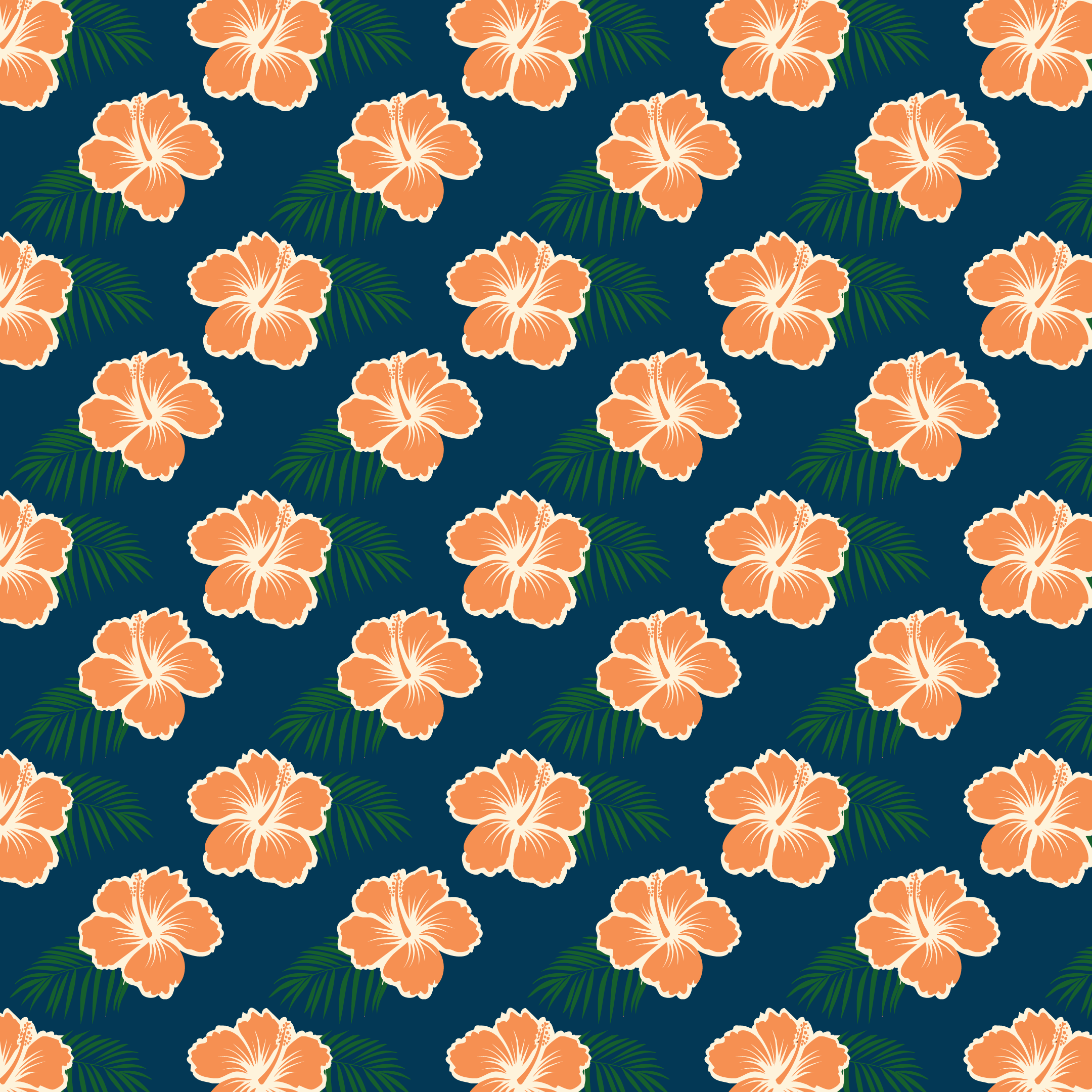
![Pattern of orange hibiscus flowers with green palm leaves on a dark blue background.]()
This pattern is a tribute to my dad and his love for aloha shirts. I wanted the piece to feel warm, personal, and full of the kind of relaxed joy those shirts always represented. The hibiscus flowers and palm leaves create an island-inspired rhythm, while the darker background adds contrast and depth. More than just a decorative pattern, this design is a way of honoring his personality, his style, and the memories connected to him.
-
![Graphic with stylized pine trees and the text 'The trees create the forest']()
This graphic reflects the idea that individual elements combine to create something larger and more meaningful. The stylized trees support the message visually, turning a familiar concept into a simple design statement about unity, systems, and perspective. I wanted the piece to feel thoughtful and easy to understand, while still having enough visual character to stand on its own.
-
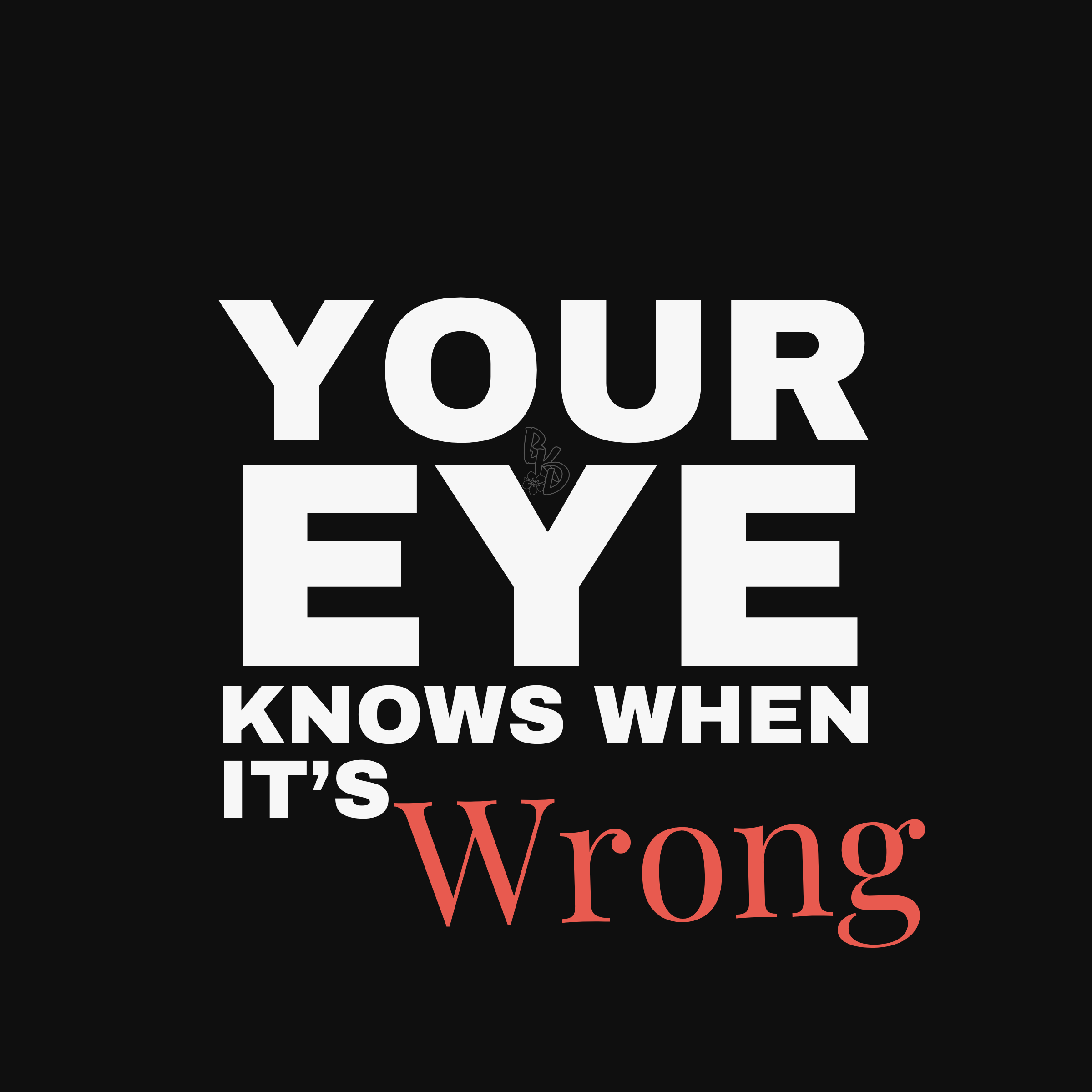
![Text in bold white and red font on black background that reads, 'Your Eye Knows When It's Wrong.']()
This design plays with the instinctive side of visual communication. Alignment, spacing, balance, and contrast are often felt before they are consciously explained, and I wanted the graphic to express that idea in a bold way. The strong typography and stark contrast reinforce the message, making the piece feel direct, confident, and intentionally uncomfortable.
-
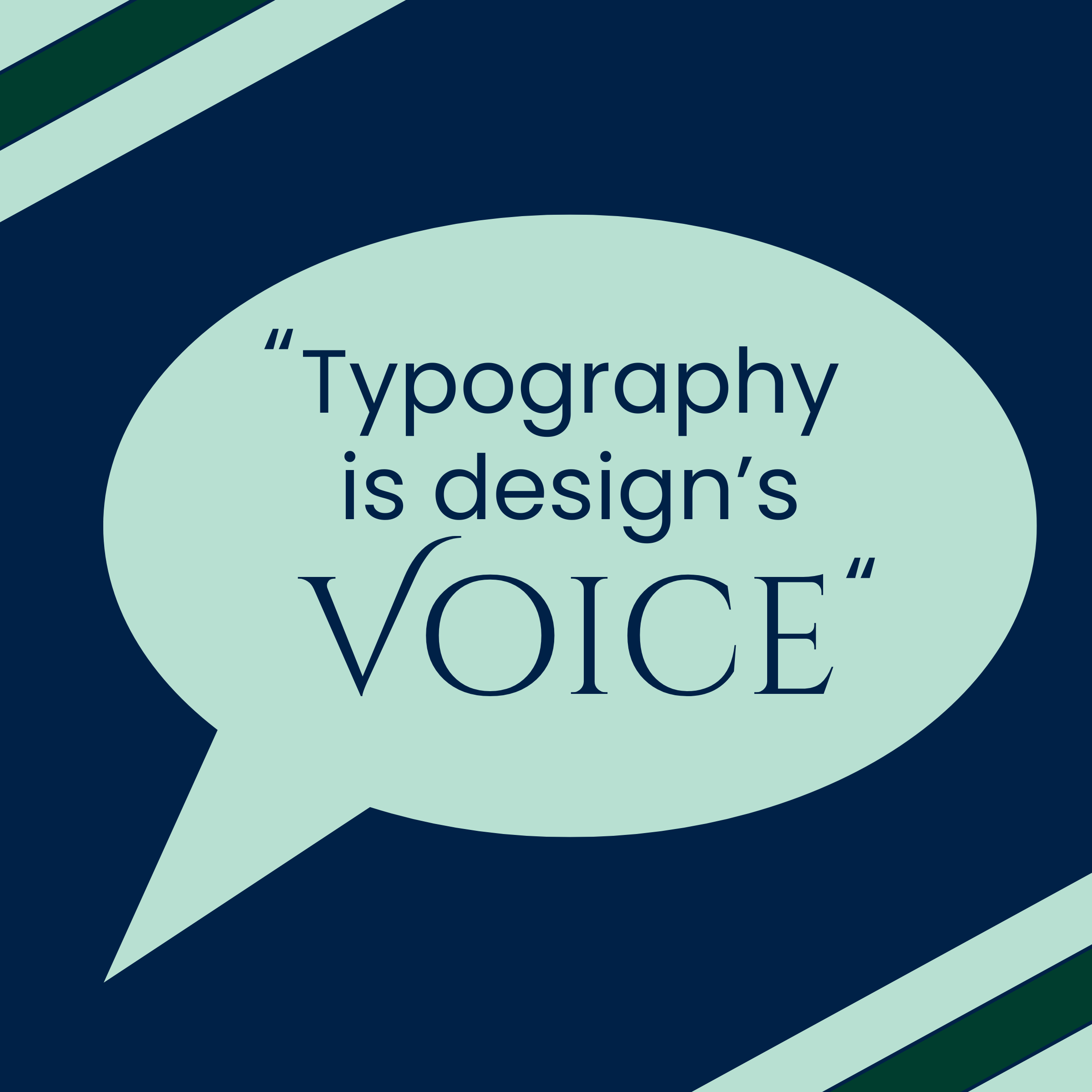
![Speech bubble with a quote about typography on a dark blue and green background.]()
This piece turns a design principle into a more conversational visual statement. I used the speech bubble and color palette to make the quote feel approachable while still emphasizing the power of typography. The goal was to show that type is not just decoration, but one of the main ways a design communicates personality, structure, and meaning.
-
![A forest scene with a path surrounded by tall green trees, overlaid with a white circle containing the text 'White space isn't empty—it's POWERFUL'.]()
This design reframes white space as an active and powerful part of composition rather than empty space. The forest image provides texture and atmosphere, while the central circle creates focus and breathing room for the message. I wanted the piece to show how restraint can strengthen a design and make the most important elements feel more intentional.
-
![A pirate-themed design featuring a skull with a red bandana, a wrench and a screwdriver crossed beneath it, and the phrase "None Can Resist the Merciless Gale" around the design, with a pirate ship outline faintly in the background.]()
This illustration was created to celebrate my dad’s D&D character, Dawk Hollandaise, and his pirate ship, The Merciless Gales. I wanted the piece to feel like an artifact from the world our group created together, something that could hang in the room while we played and immediately bring that character and story to life. The skull, tools, and pirate imagery give it a gritty, adventurous feel, while the overall design serves as a tribute to my dad’s creativity, humor, and presence at the table.
-
![Collection of black and white pirate-themed and fantasy illustrations on a black background, including a ship with billowing sails, skulls, a pirate with an eye patch, a sword and shield, a crown with a serpent, an octopus with the phrase 'Y MANO Y MANO Y,' an open book with symbols, a skull with a pirate bandana, a winged creature, and a chalice.]()
This flag was created for the crew of The Merciless Gales, with a unique pirate-inspired mark representing each member of the group. In the story of our D&D campaign, it was meant to hang in the captain’s quarters where the crew would gather, plan, and prepare for whatever came next. The design brings each character’s identity into one unified piece, showing that even with different personalities, roles, and stories, they were all part of the same crew. It also includes a representation of our Dungeon Master, honoring the person who guided the world and helped bring the adventure to life.
-
![Stylized graphic with a crest featuring a blue lion on a blue background, crest divided diagonally with yellow and red vertical stripes, with the text 'SEC' and the number '26' in yellow.]()
This flag was designed for Section 26 and flew at every home match for a full season. I wanted it to feel bold, recognizable, and rooted in supporter culture, with a visual identity that could represent the section from the stands. The lion, shield, stripes, and number system create a strong sense of pride and belonging, while the overall composition gives the flag an official, crest-like presence. More than just a graphic, this piece became part of the matchday environment and a symbol of the community I stood with each week.
-
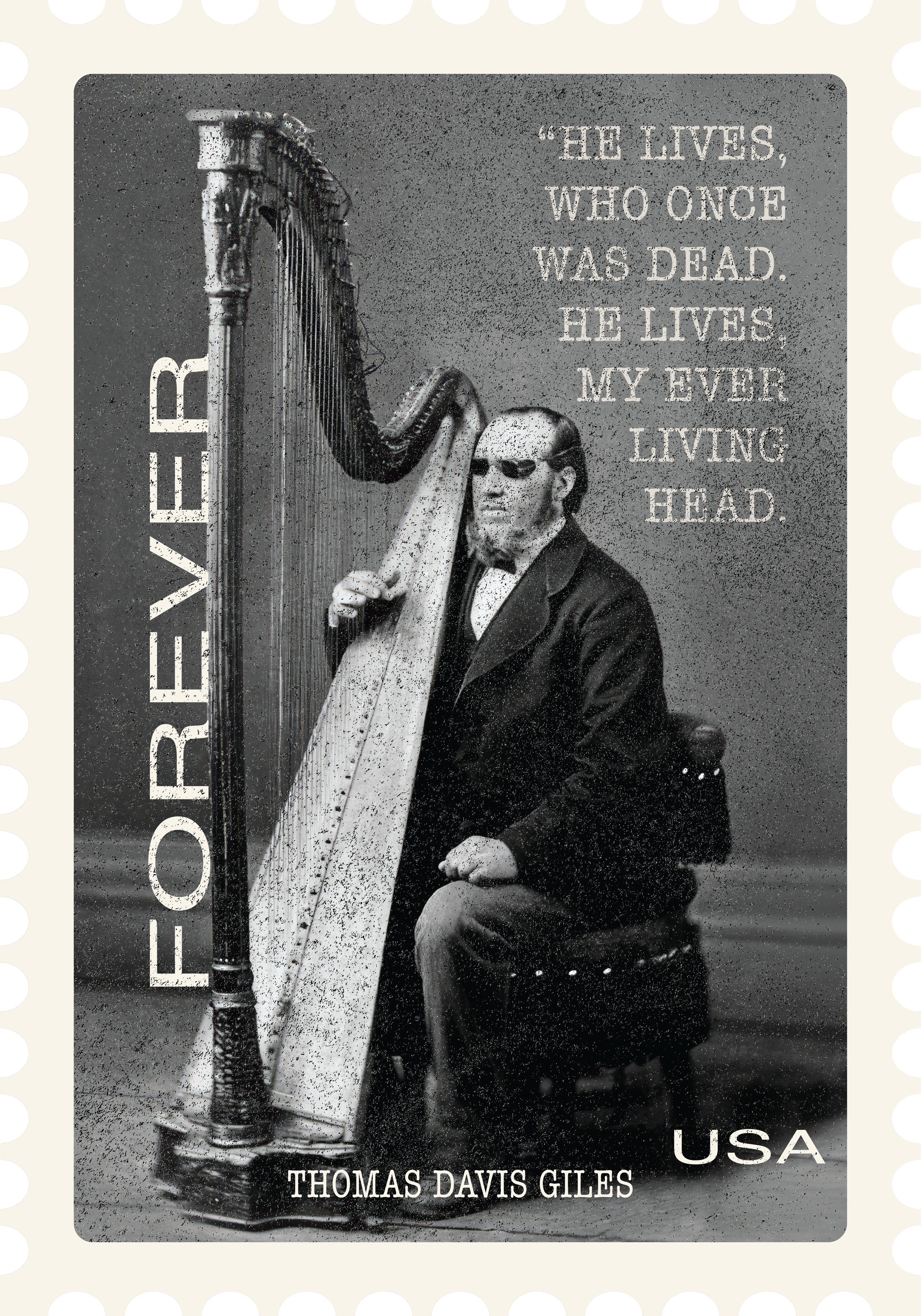
![]()
This stamp honors Thomas Davis Giles, the blind harpist who pulled a handcart to join the Saints in Salt Lake City, Utah. He also happens to be part of the reason I carry the name Giles. I used a photo of him with his beloved harp as the main focal point, making the image the strongest element in the hierarchy. The vertical “FOREVER” title creates a bold secondary read and reinforces the theme of legacy. It also serves to mark the stamp as a forever stamp for postage purposes. The hymn text in the upper right comes from his personal favorite hymn and can also be found on the monument in his honor in Salt Lake City. It adds personal context to the image while staying visually quieter than the portrait. I wanted the stamp to feel historic while taking the observer through a moment of his incredible story.