Utah Bill of Sale Builder
Designing a legally grounded bill of sale that reads like a real document, with a guided flow that helps users complete it correctly on the first try.
Guided form flow · Document design · Compliance-informed IA · 75-user test
Project Overview
Company: Patriot Listings
Product: Public web experience (bill of sale generator)
Role: UX/UI Designer
Primary deliverable: Utah Bill of Sale document + guided step-by-step completion flow
Interaction model: Wizard flow with persistent live document preview
Status: Prototype validated
Private-party sales move fast. Users need a bill of sale that is readily available, easy to complete, and defensible as a record. The hard part was not “making a form.” The hard part was designing a document that looks and behaves like something people already trust, then wrapping it in an experience that prevents errors and supports comprehension.
All data shown is for demonstration purposes only and does not reflect actual users/persons.
At a Glance
-
Bills of sale are easy to find, but hard to trust. Existing options were either too vague to feel legitimate, or too dense to complete correctly without second-guessing. Users needed a faster way to create a Utah-compliant record without needing to interpret legal language or hunt for missing fields.
-
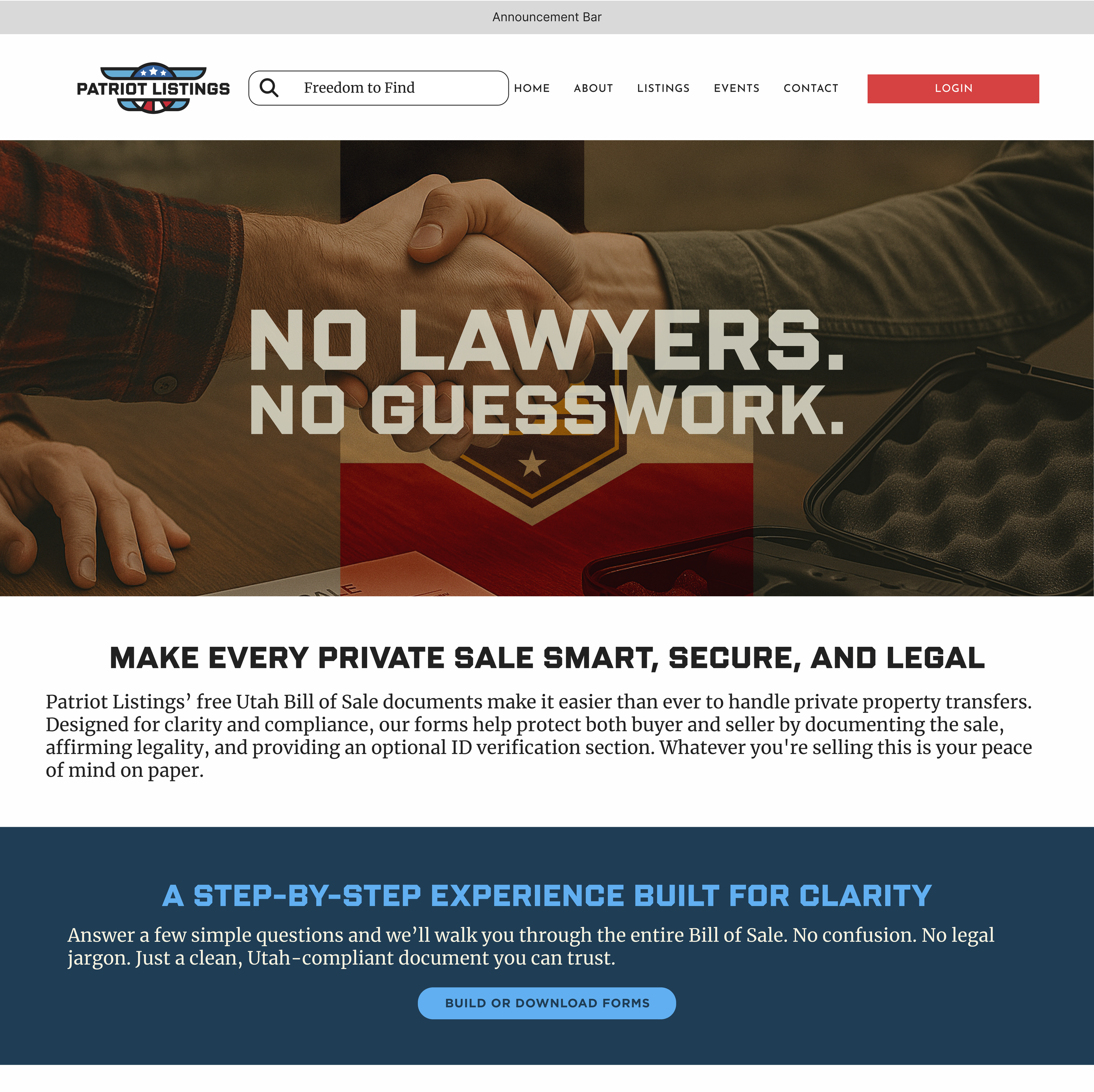
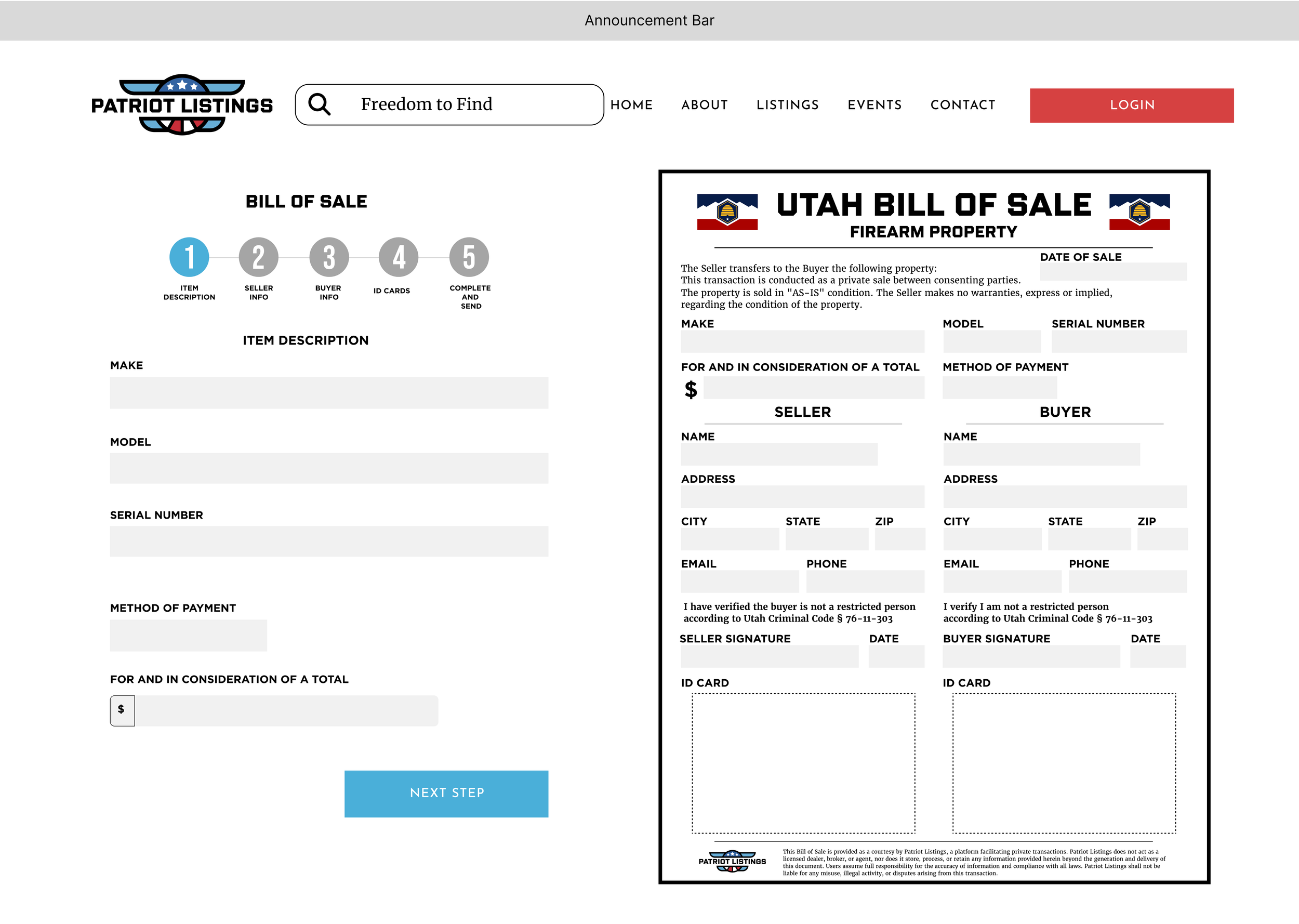
A Utah Bill of Sale document built around required elements and clear hierarchy
A guided 5-step flow that generates the document in real time
A persistent preview so users can see what they are creating and catch issues early
A completion experience with download, print, and record-keeping prompts
-
96% of 75 users completed the prototype with no questions
93% answered all 15 comprehension questions correctly after completing the flow
Users rated the new experience more favorable than competitor forms
The Problem
Users needed to complete a bill of sale with high-confidence accuracy, even when they were doing it for the first time. The experience had to support two outcomes at once:
Goals
For Users
Make the bill of sale scannable and completable without prior familiarity
Reduce uncertainty by keeping the final document visible throughout completion
Prevent errors through step structure and consistent field patterns
Clarify what key statements mean at the moment users sign
For Patriot Listings
Provide a readily available, repeatable bill of sale experience that improves trust
Reduce abandonment and “I’m not sure what this means” confusion
Produce a print-ready record that functions as the product, not just a submission
Constraints
The experience needed to serve both seller and buyer cleanly, without mixing responsibilities
The output needed to print cleanly and read like a document, not a web page
Compliance-informed fields and acknowledgements needed to be present without turning the UI into a wall of legal text
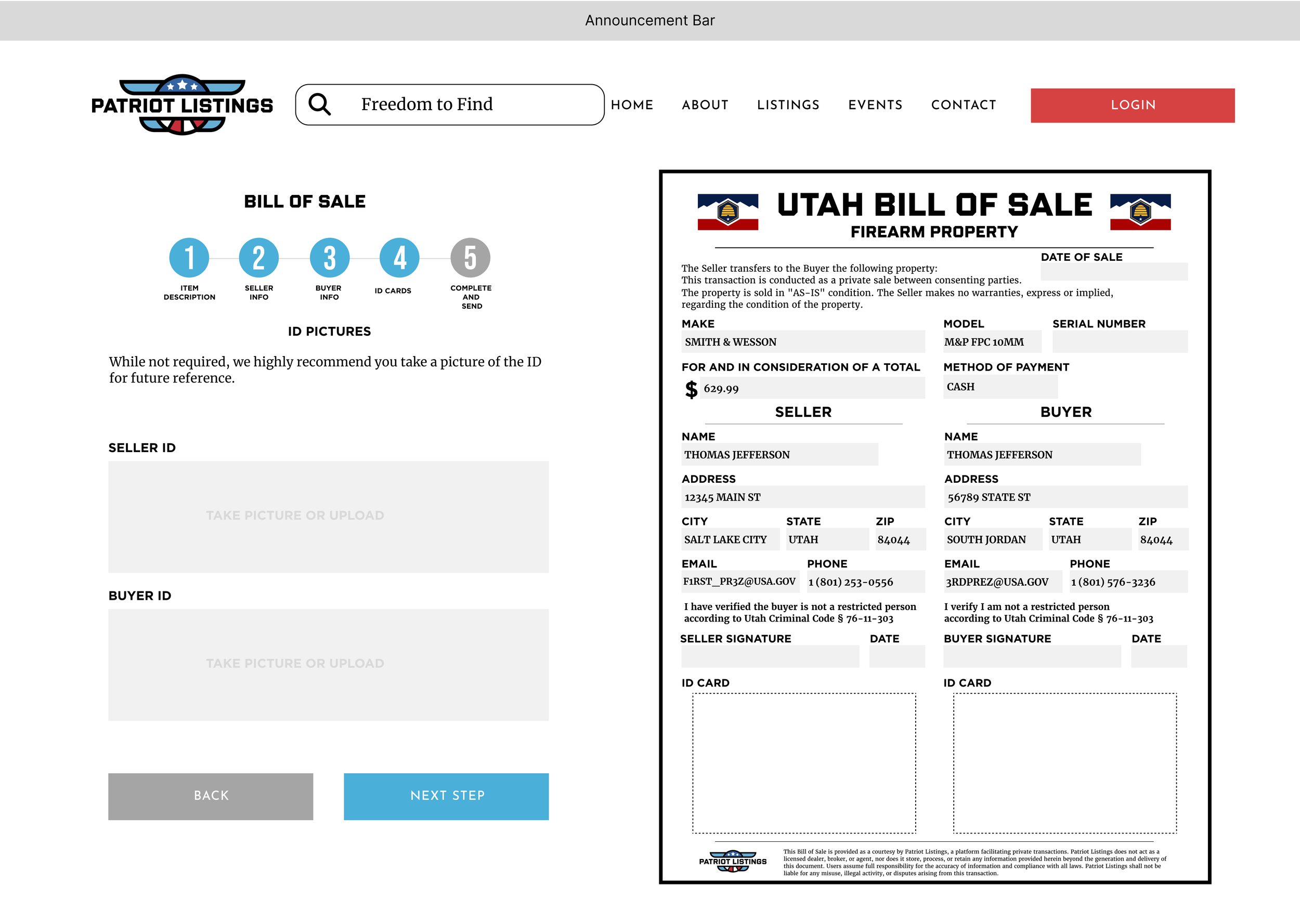
ID capture needed to be encouraged as best practice, without creating unnecessary friction
My Role & Responsibilities
Research for the Document & Flow
I treated the bill of sale as a record and disclosure artifact, not just a form. That means the design has to do more than collect inputs. It has to:
Present the right information in an order people naturally sanity-check
Make key affirmations understandable at the point of signature
Produce an output that looks and feels legitimate as a printed record
That framing directly shaped the hierarchy of the final document and the decision to keep the user anchored to the output while completing the steps.
Compliance inputs
To ensure the record aligned with Utah expectations, I translated Utah bill of sale requirements into: required fields, optional but recommended details, and explicit acknowledgements. This mapping directly informed the step sequence and the final print-ready structure.
Process
Reframed the task as “create a trustworthy record”
Instead of optimizing for speed alone, I optimized for “fast plus confident.” The live preview was a deliberate decision to reduce uncertainty and let users verify the record as it forms.
Built the flow as a predictable completion journey
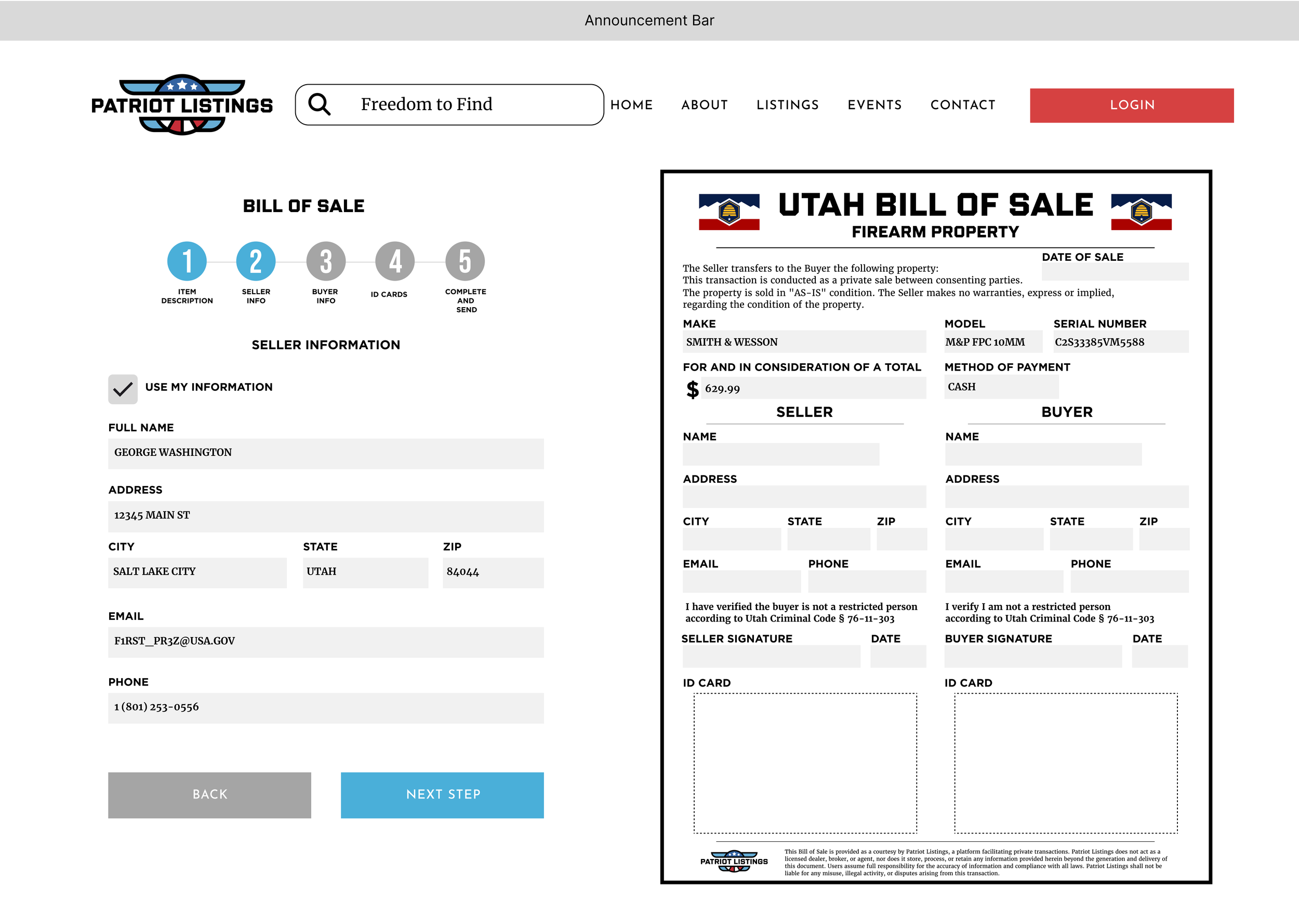
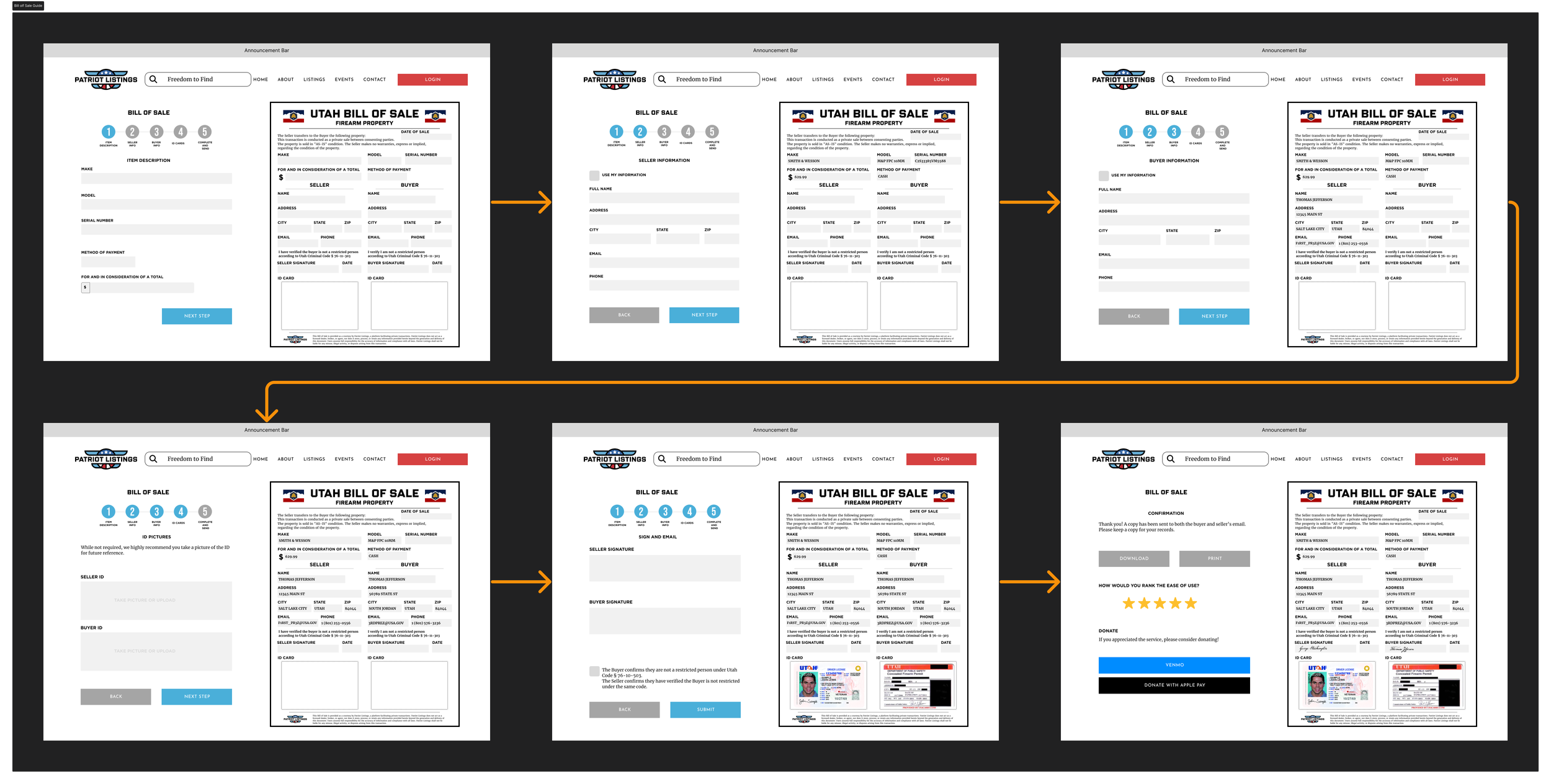
The final structure is ordered to match how people think about the transaction:
Item description (ground the deal in concrete details first)
Seller info (identity)
Buyer info (identity, mirrored for consistency)
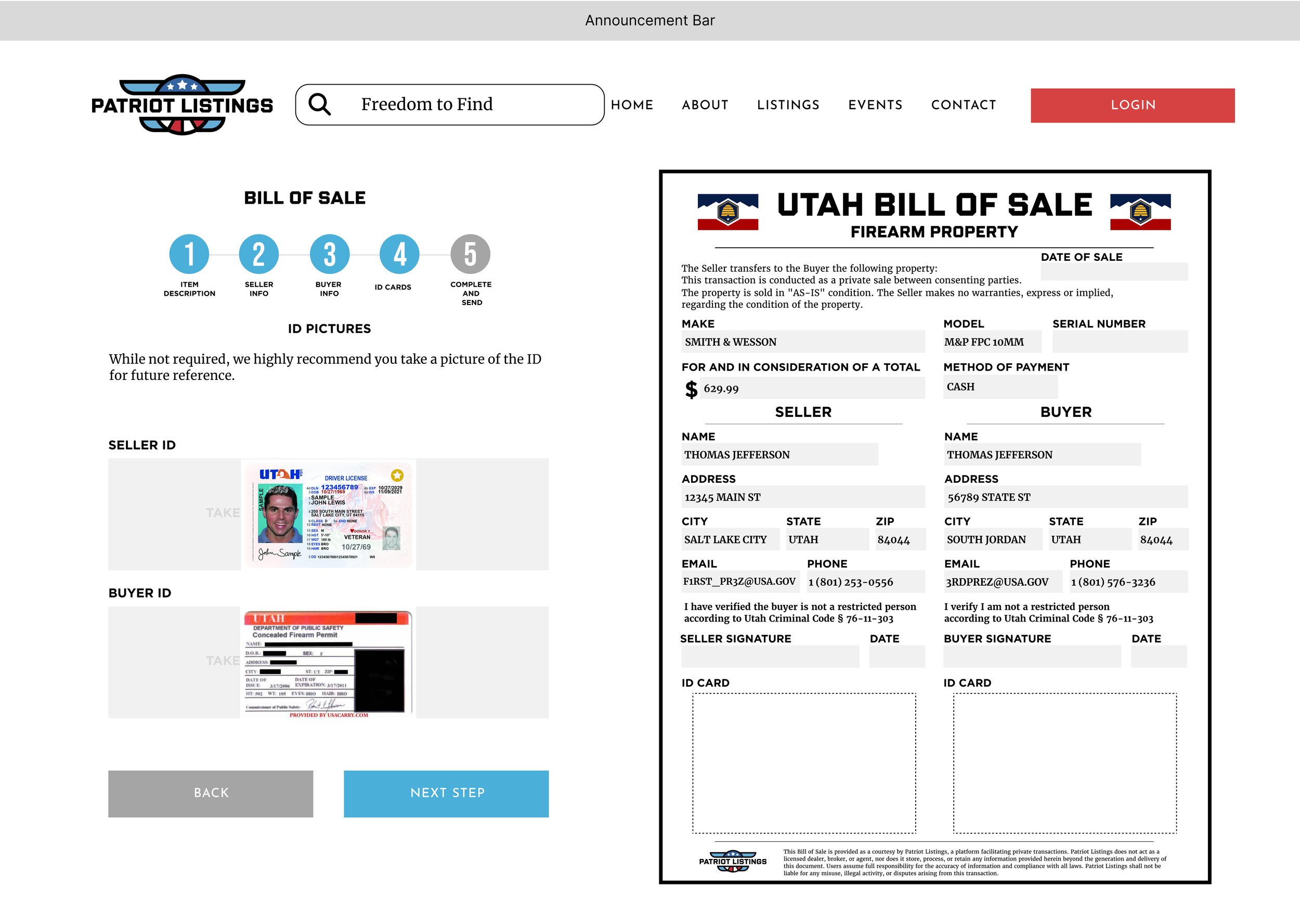
ID pictures (recommended for record-keeping)
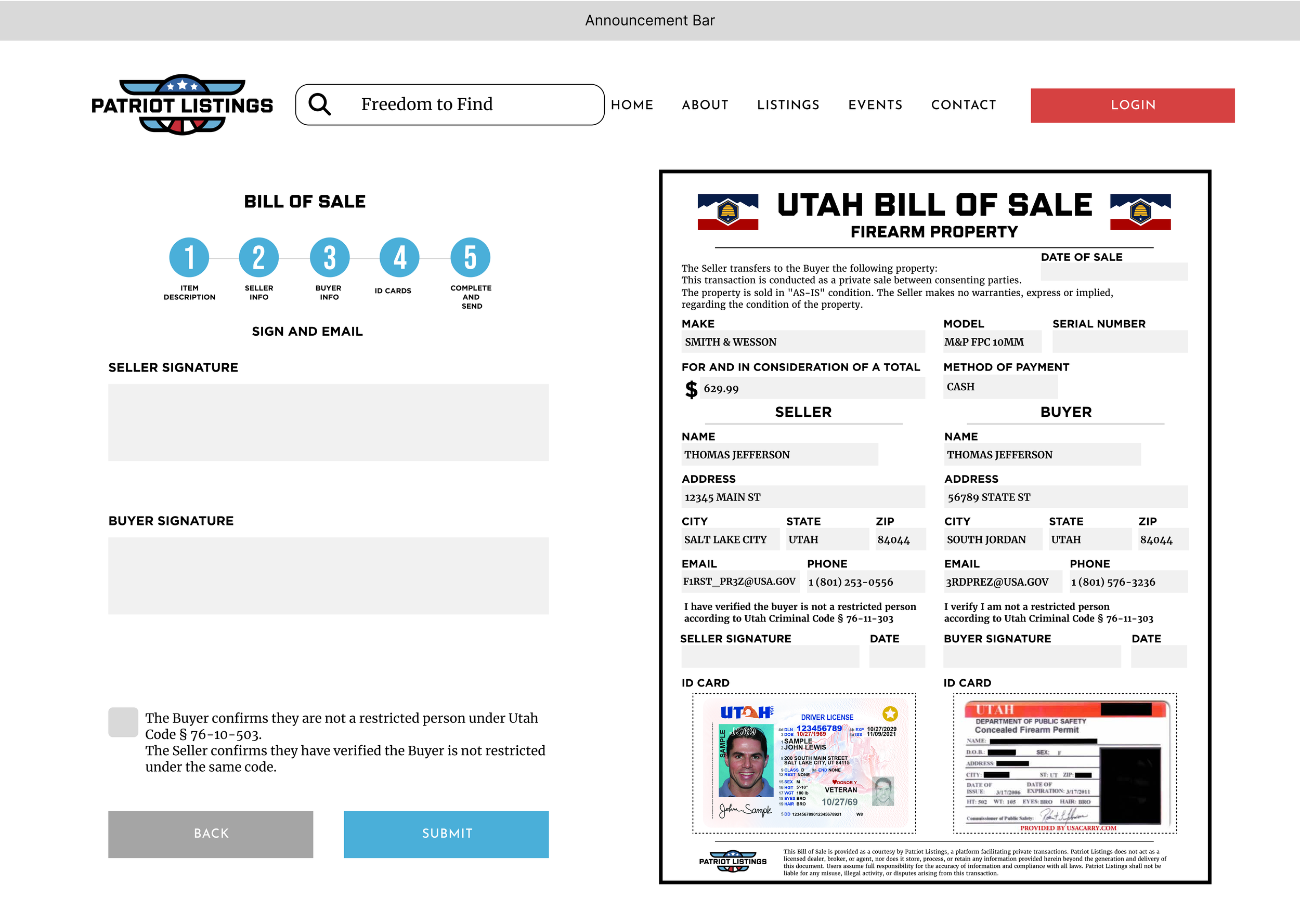
Sign and download (commitment and acknowledgement at the decision point)
This sequence keeps the form from feeling like paperwork, while still capturing everything needed to produce a complete record.
Used Symmetry to reduce errors
Seller and buyer screens intentionally share the same field layout, order, and patterns. Once the user completes one party, the other becomes recognition, not relearning.
Made ID Capture a best practice, not a blocker
ID photos are framed as “highly recommended” for future reference, with a clear upload affordance and a visible landing area in the final document. This increases compliance without pushing users away.
Designed the end state around “what do I do now?”
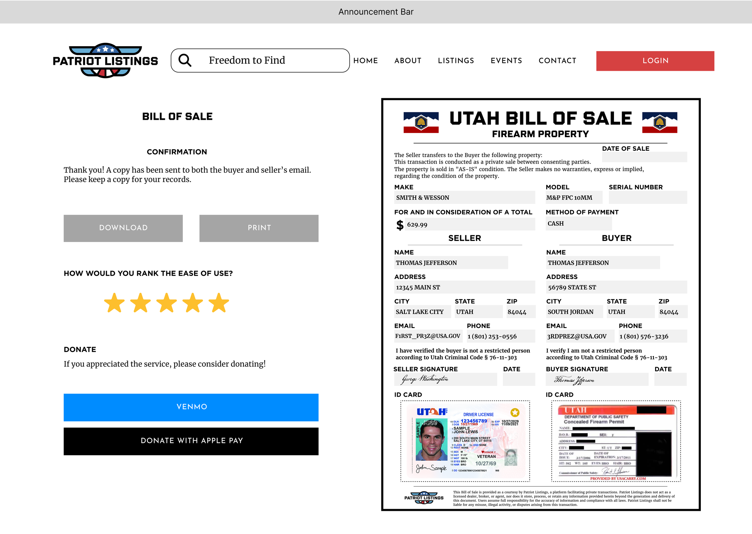
The confirmation screen prioritizes record actions first (download, print), then gathers feedback (ease-of-use), then offers optional support (donation). That keeps completion feeling finished and purposeful.
Prototype Validation
Goal
Confirm users could (1) finish the document without assistance and (2) accurately explain what they were affirming.
Participants
75 adults (ages 21–68), mixed genders.
Method
Participants completed the guided bill of sale prototype and generated a finalized record.
Participants answered a 15-question comprehension check covering:
what each section means
key statements and acknowledgements
what the final record represents and how it should be used
Participants compared the guided experience against common alternatives (static templates and typical form experiences) and rated favorability.
Success criteria
Users complete the flow without needing clarification
Users can accurately explain the purpose and meaning of the record
Users prefer the guided experience over alternatives
Results
96% completed the prototype with no questions
93% answered all 15/15 comprehension questions correctly
Users rated the guided experience more favorable than competitor forms
What I Delivered
-
A 5-step wizard that chunks information by intent, keeps users oriented, and prevents mistakes through consistency and predictable navigation.
-
A print-ready record designed with clear hierarchy and spacing, optimized for scanning and for use as a reference after the transaction.
-
A completion state built around real post-task needs: download, print, and retention.
-
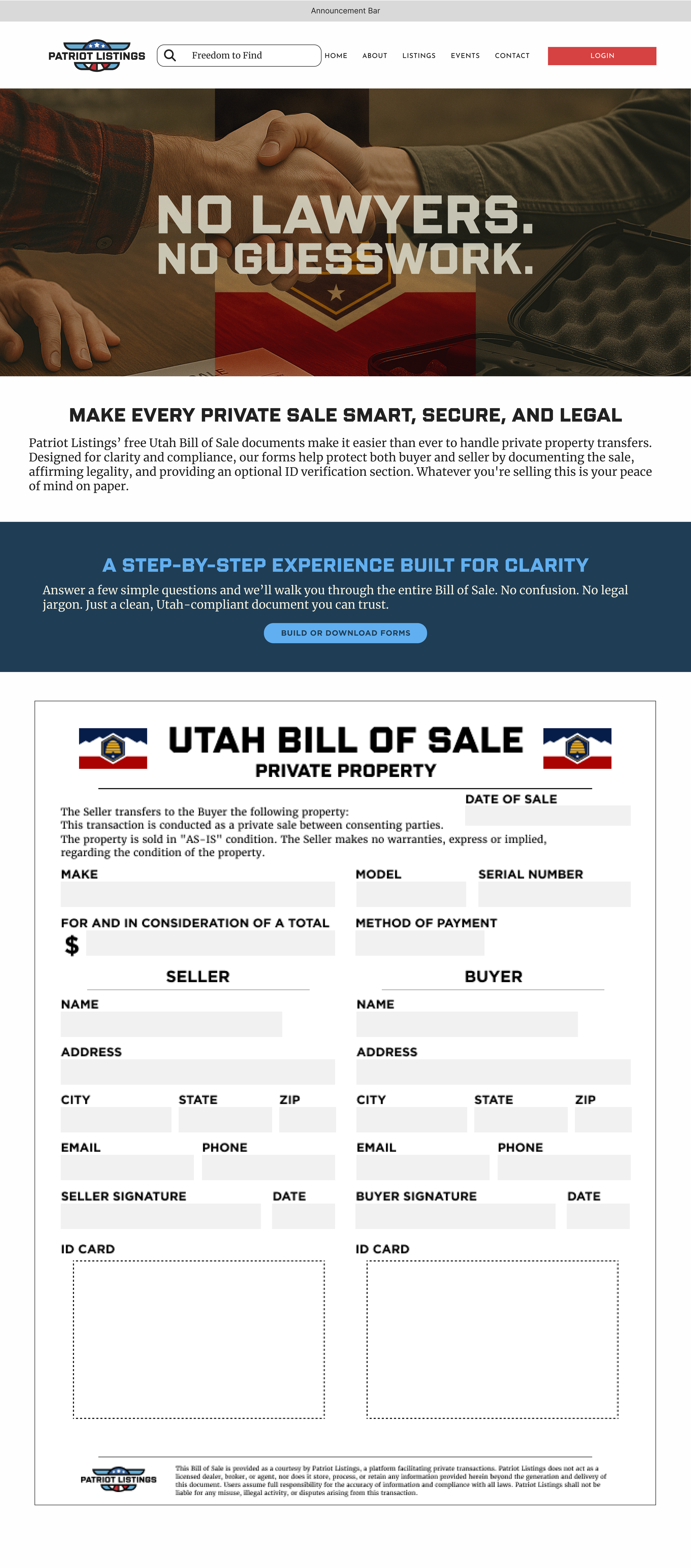
I designed a dedicated landing page to funnel users into the Bill of Sale flow with confidence. The page uses a bold hero message to establish trust, then quickly explains what the document does, why it matters, and what users can expect from the guided experience. A single primary CTA drives entry into the form, while a document preview reinforces credibility and sets a clear mental model for the output.
After-launch Measurement Plan
Once shipped, success will be tracked with product analytics and support signals:
Completion rate and drop-off by step
Time to complete
Error and correction frequency (by field)
Reprint/regeneration rate
Support contact rate related to bill of sale creation
User feedback on clarity, confidence, and usefulness of the final record
Figma Artifacts & Prototype