
Axomo Billing & Statements
Redesigning billing statements to read like a bill people already know how to understand
IA redesign - Behavioral research - 25-user test
Project Overview
Company: Namify / Axomo
Product: Axomo Store Admin web app
Role: UX/UI Designer
Primary deliverable: Statement redesign (information hierarchy, grouping, and drill-down navigation)
Interaction model: Page-to-page navigation only (no modals)
Status: Design approved, queued for development (not yet live)
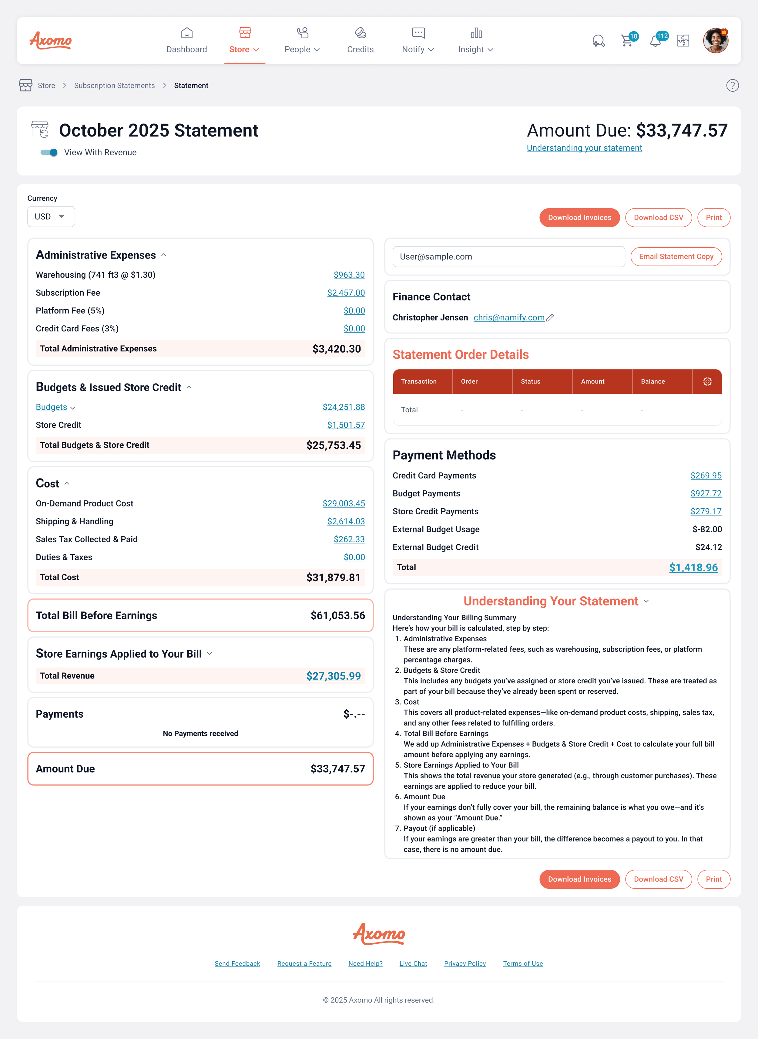
As Axomo stores scale, billing becomes operational. Store Admins need to quickly confirm totals, understand what drove charges during a period, and route documentation to accounting without needing support to translate the statement.
The heaviest lift in this project was the Statement itself. I rebuilt how the statement is organized and sequenced to match the way people naturally read everyday bills (phone bills, utilities): orient first, confirm the big numbers next, understand drivers through grouped sections, then drill deeper only when needed.
*All “user data” shown is for demonstration purposes only and does not reflect actual users/persons.
At a Glance
-
Statements contained the right data, but the layout and ordering did not match how users expect bills to work. Admins had to interpret dense information, which slowed comprehension and increased follow-up questions.
-
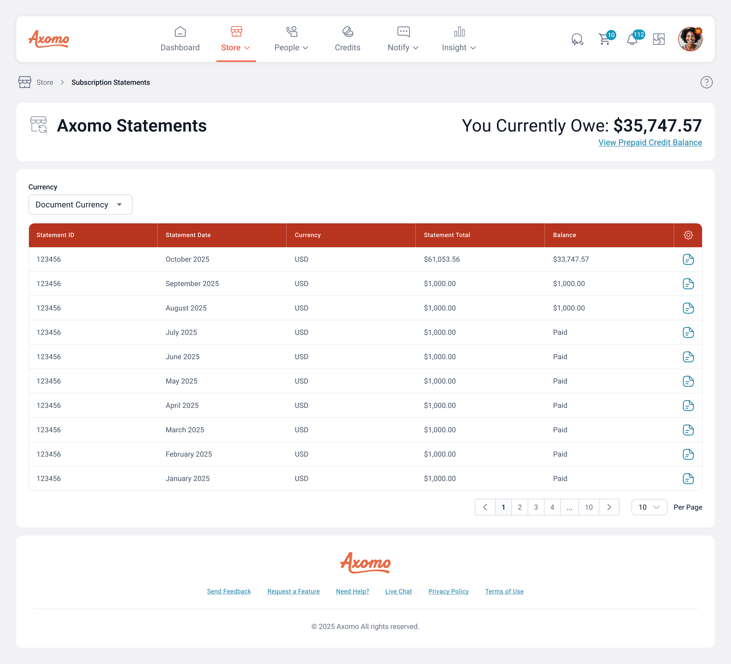
A Billing hub listing all statements by period
A redesigned Statement page with a bill-like hierarchy and clearer chunking
Drill-down links from statement sections to deeper reports scoped to the statement period
A navigation-first flow across pages with predictable back paths
-
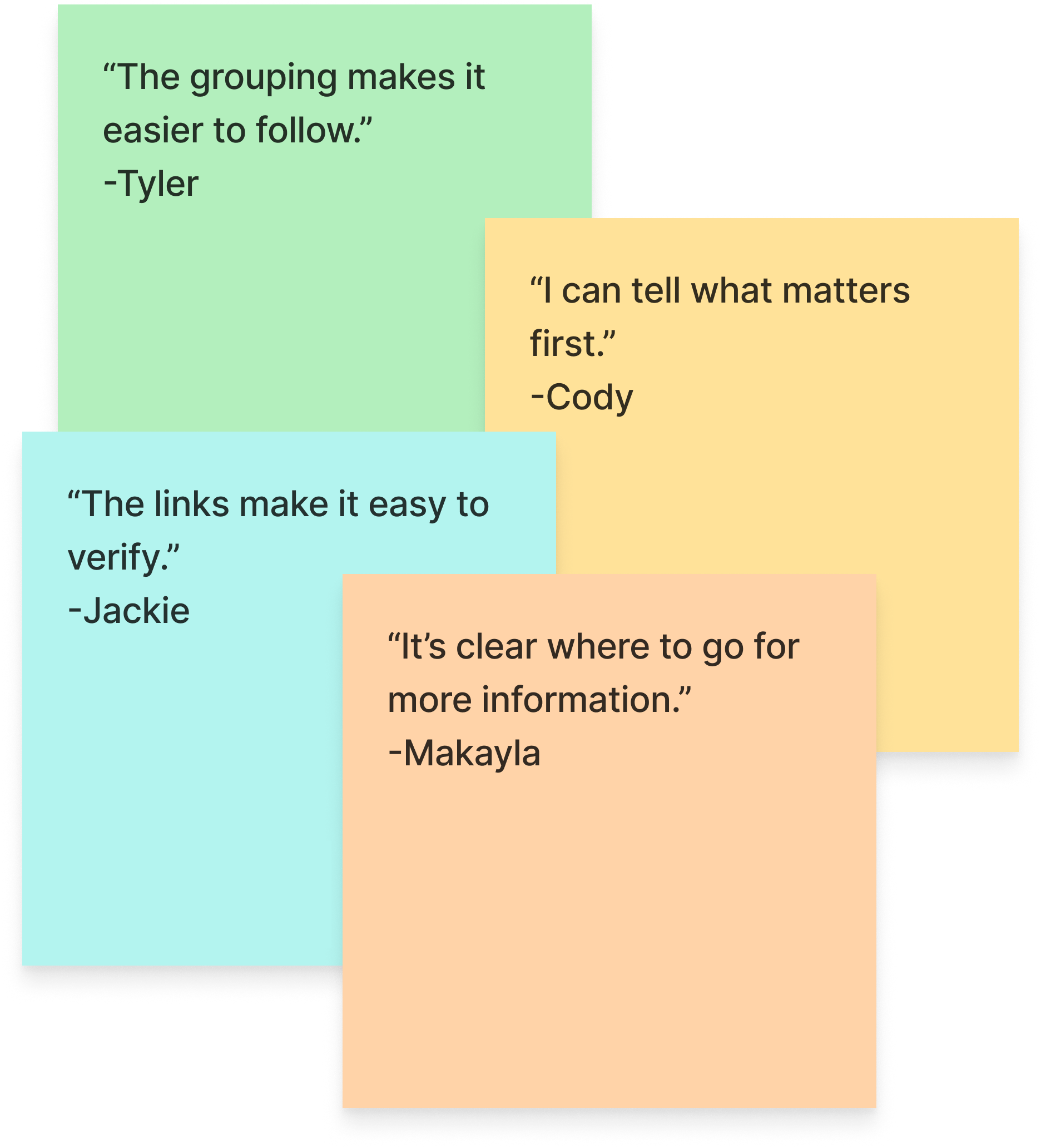
In usability testing, 70% of participants more accurately understood the redesigned statement, including participants who do not normally work with statements.
The Problem
Store Admins needed to answer four questions quickly
Goals
For Store Admins
Make the statement scannable in under a minute for the common case (confirm and forward to accounting)
Organize information in a hierarchy users already trust from everyday billing documents
Provide clear drill-down paths to validate activity inside the statement period
Keep interactions consistent through page navigation only
For Internal Teams
Reduce “interpretation” work caused by unclear grouping and sequencing
Improve clarity and audit confidence by making totals, period context, and cost drivers obvious
Make investigation easier by linking statement sections directly to supporting reports
Constraints
My Role and Responsibilities
Research For The Restructure
I treated the statement as a disclosure artifact, not just a report. I grounded the redesign in behavioral and disclosure design guidance focused on comprehension, clarity, and reducing cognitive overload, especially principles around:
Chunking and hierarchy to reduce cognitive load and make complex bills usable.
Presentation that supports consumer understanding, using layout and headings to help people find and interpret key information.
“Clear and conspicuous” expectations, emphasizing that information must be reasonably understandable and not obscured by layout choices.
Those principles directly shaped the new statement reading order and the decision to keep deep detail in drill-down reports instead of cluttering the primary statement.
Process
-
Instead of designing the statement like a dense table, I designed it like a bill narrative:
Orientation: period and context first
Summary: the numbers most people need right away
Grouped drivers: sections that explain what caused the total
Verification paths: links to deeper reporting when users need proof
-
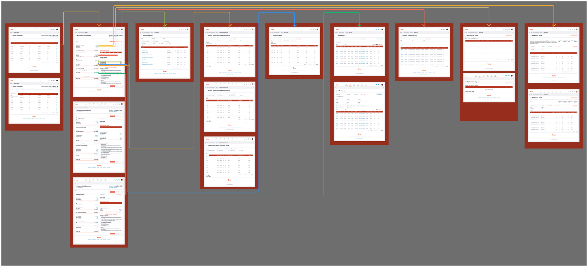
Because the interaction model was page navigation only, I made the structure explicit and predictable:
Billing hub: choose a statement period
Statement page: understand the story of that period
Drill-down reports: validate details for the same period
Return to statement: keep period context and continue scanning
This kept the statement clean for the common case while still supporting deep investigation.
-
A key copy iteration came from testing. My first version titled the intro section “Knowing your ABC’s” (referencing statement section headers), but users reported it felt diminishing in a context where they are accountable for real costs. I updated the copy to “Understanding Your Statement” to be direct, neutral, and respectful.
-
The final statement structure is intentionally ordered to match the way users sanity-check a bill:
Administrative Expenses
Budgets & Issued Store Credit
Cost
Total Bill Before Earnings
Store Earnings Applied to Your Bill
Amount Due
This sequence makes it easy to answer:
“What are the administrative parts vs the program activity?”
“What did we issue that impacts cost?”
“What is the true subtotal before offsets?”
“What earnings offset the bill, and what’s left to pay?”
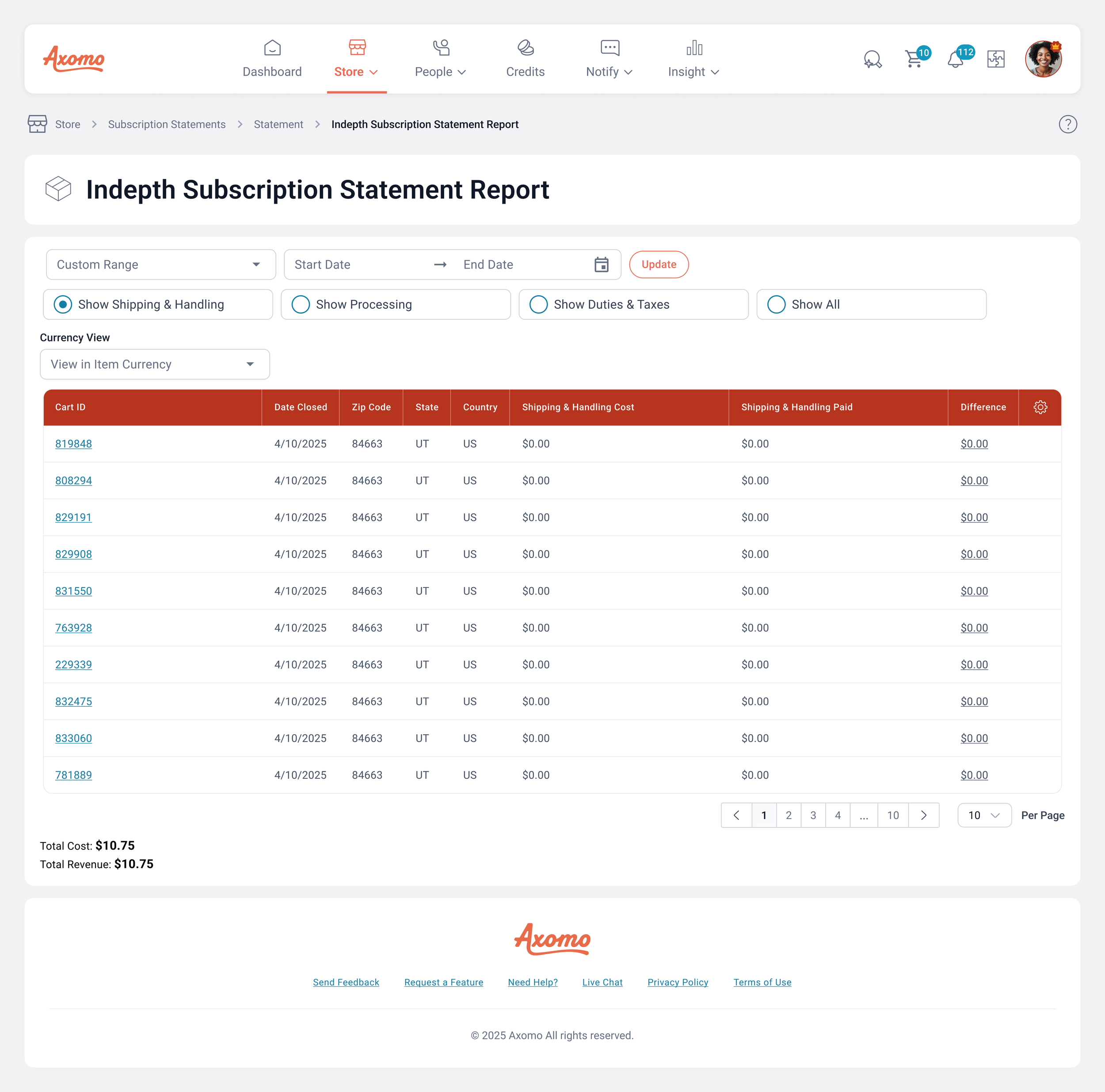
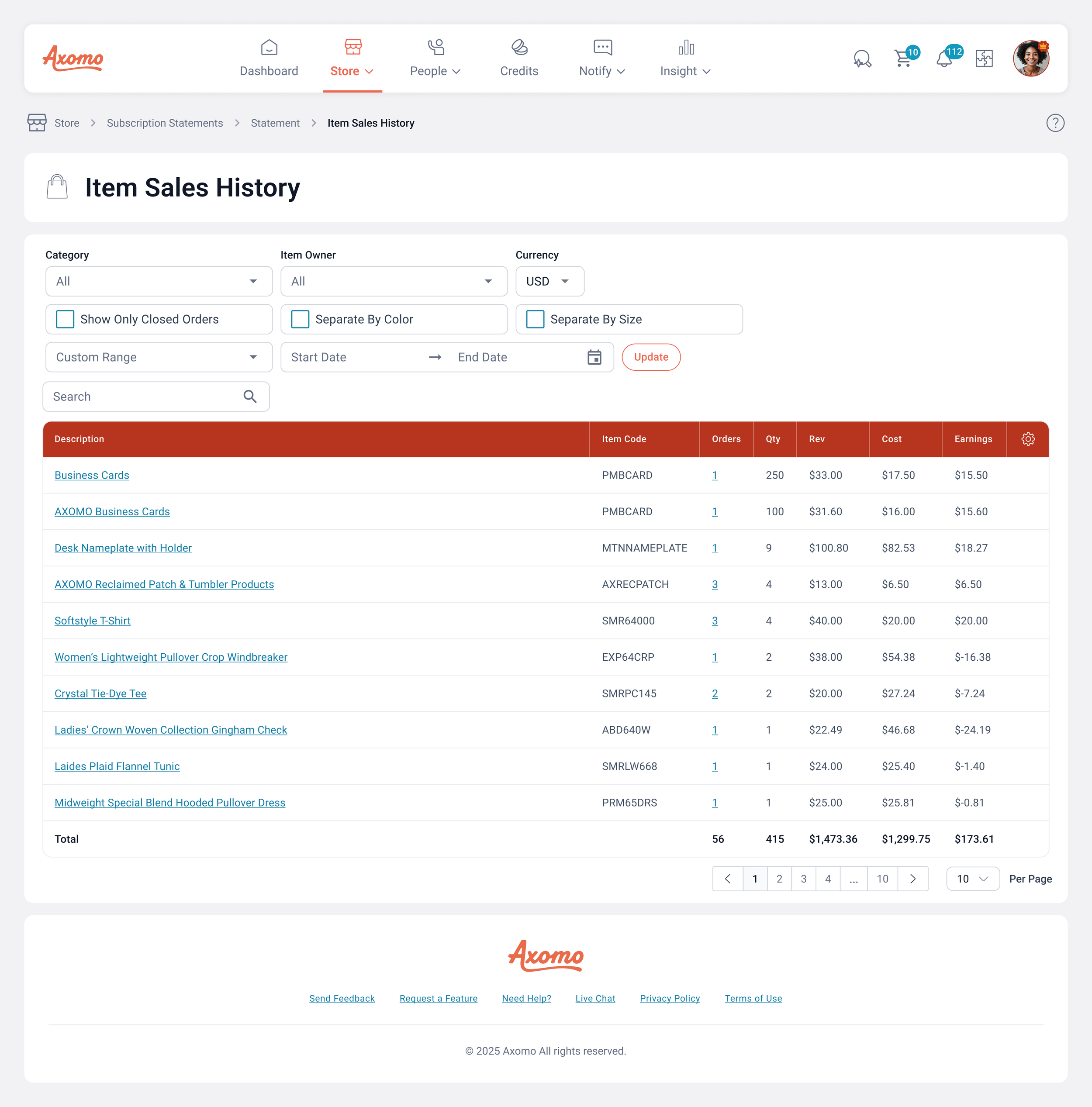
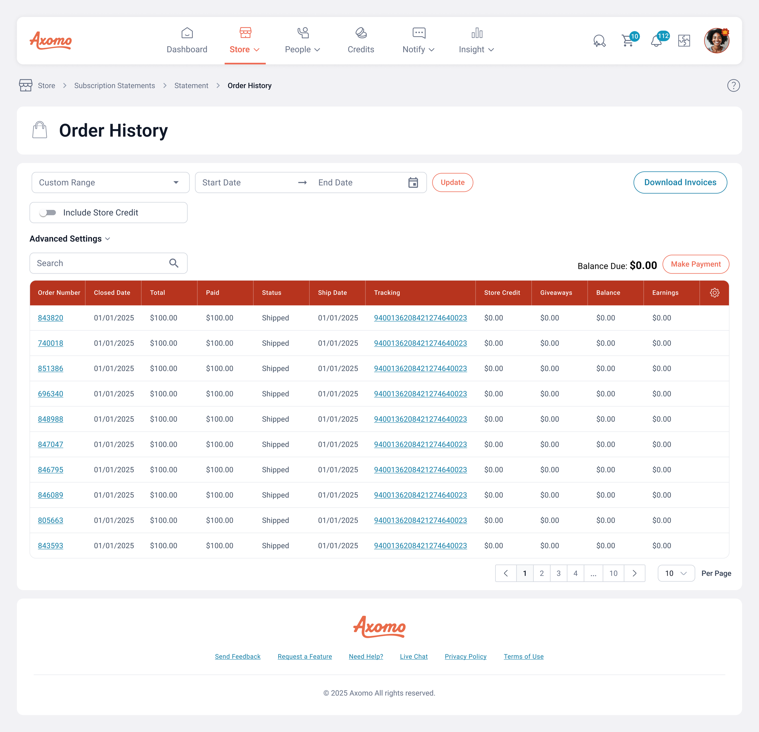
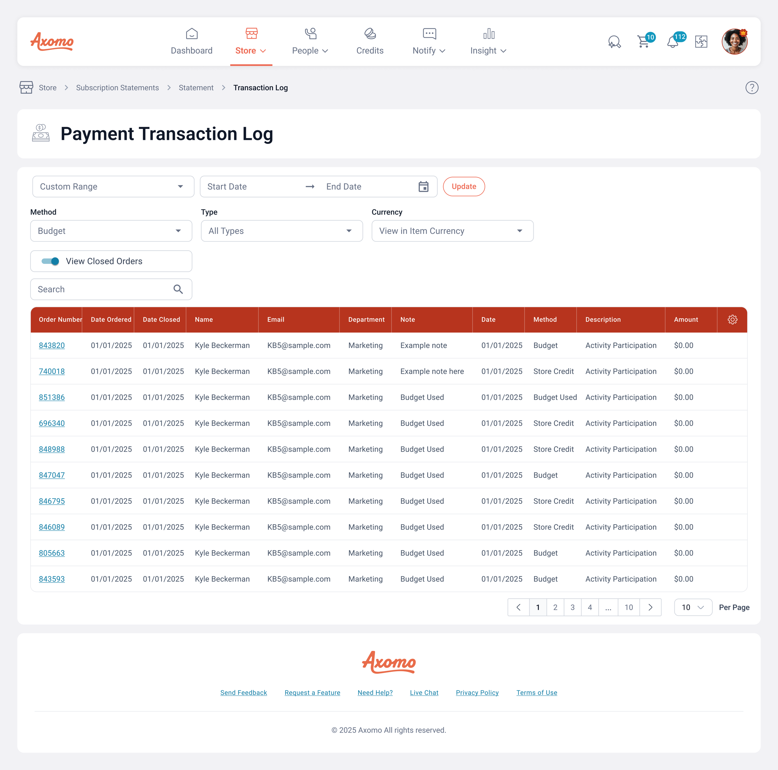
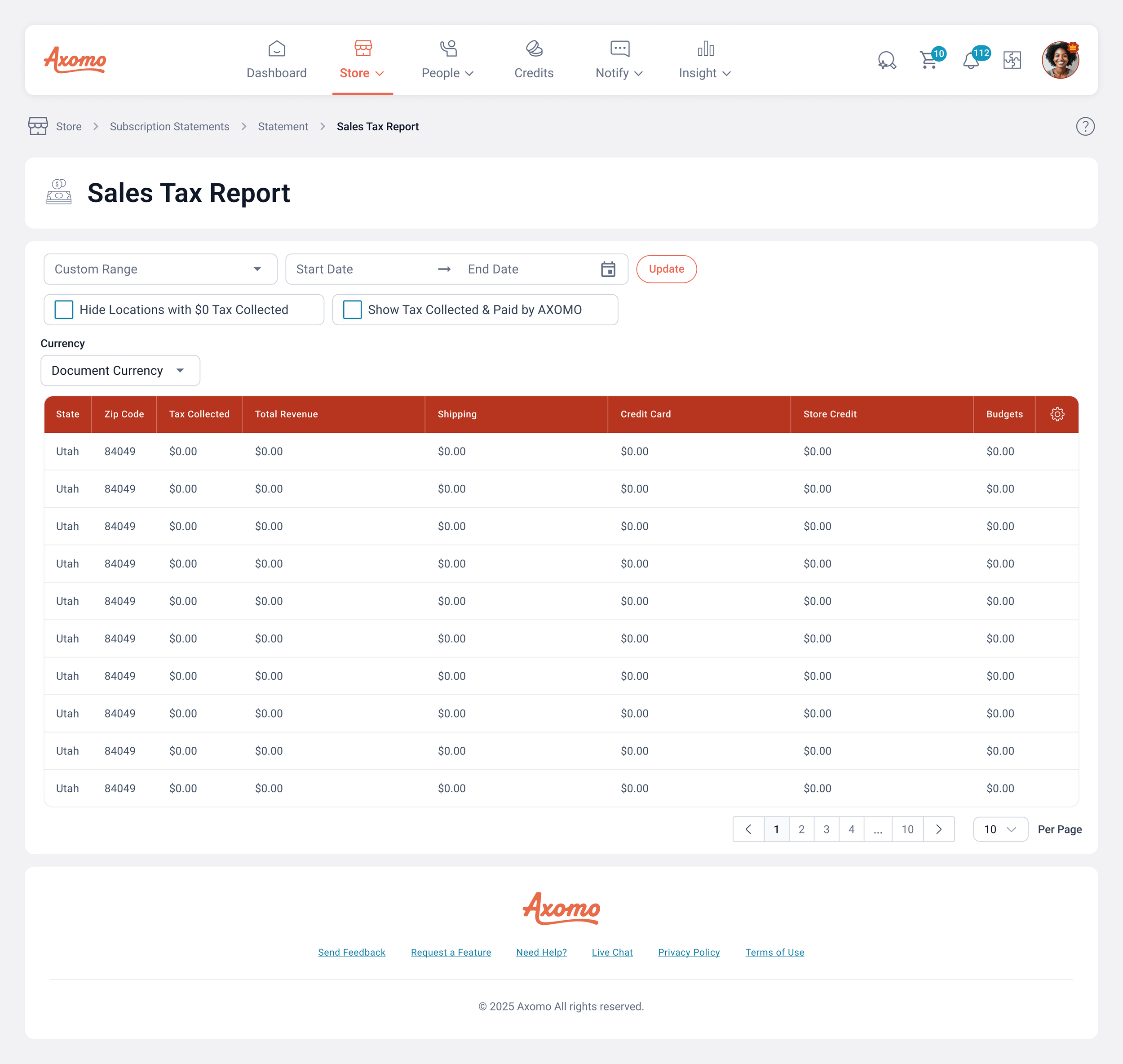
Each section includes a drill-down link to deeper reports for that same statement period, so users can validate details without losing context.
Validation
To confirm the restructure improved comprehension beyond “experienced billing users,” we tested with a mixed set of participants, including users who do not normally work with statements.
Study design
Participants: 25 users
Method: Each participant was given the statement prototype and a list of questions that required them to:
locate key figures (period, totals)
explain what sections meant in their own words
interpret grouped content and describe cost drivers
use drill-down links to validate details within the statement period
Result: 70% of participants more accurately understood the statement in its new form, with repeated qualitative feedback highlighting the improved chunking and organization as the biggest change.
What Changed
-
The redesigned statement leads with orientation and summary, then moves into grouped drivers, so users can build understanding without digging.
-
Users no longer had to mentally organize raw data. The structure does that work for them, making the statement faster to scan and easier to explain to accounting.
-
Each major section links to deeper reports filtered to the statement period, allowing investigation without breaking context.
-
“Knowing your ABC’s” was replaced with “Understanding Your Statement” after testing showed the original phrasing reduced perceived professionalism and trust.
-
Every action is a destination with clear back paths
Before
After
Design Solution
Billing Hub
A centralized hub listing statements by period so users can quickly find the right statement without hunting.
Statement Page
A redesigned statement that reads like a familiar bill:
clear period context
summary-first layout
grouped cost drivers
drill-down links for verification
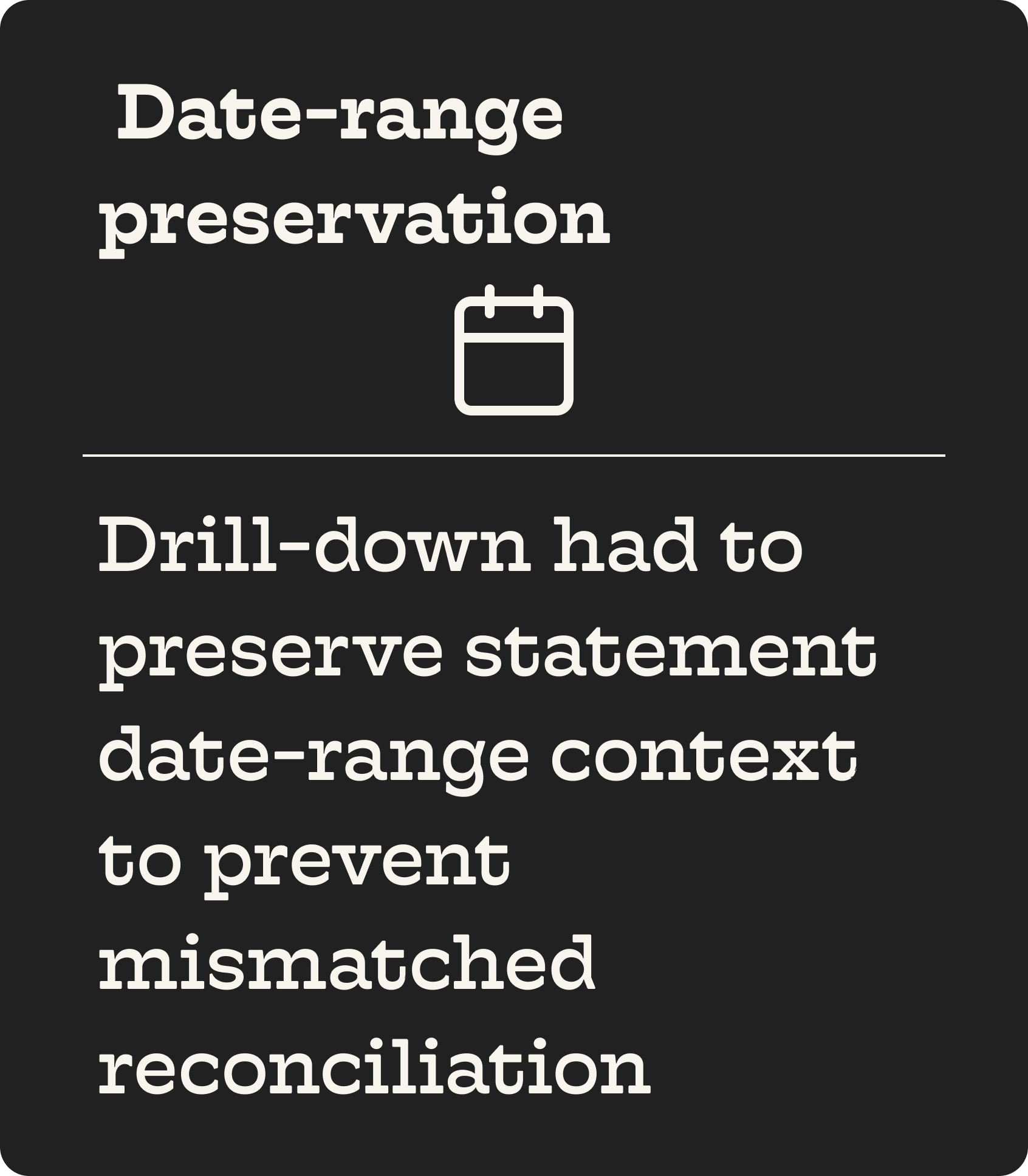
Drill-down reports
Supporting report pages that let admins validate the “why” behind a section without risking mismatched timeframes or losing their place in the statement.
Outcomes (approved, not yet live)
A statement format rebuilt around evidence-backed comprehension principles.
Clearer presentation aligned with “reasonably understandable” expectations for disclosure-style information.
A hub-and-spoke navigation model supporting fast scanning and deep investigation
Copy improvements driven by user testing feedback
A measurable pre-launch comprehension lift: 70% of 25 users more accurately understood the redesigned statement
“Success meant correctly identifying the Amount Due, explaining Cost vs Earnings offsets, and interpreting at least 4 of 6 sections in their own words.”
“Before, I felt like I had to piece the story together myself. Now it reads like a real bill, so I can scan it, understand what changed, and move on. The drill-down links are a big deal, it feels like I can verify the details without guessing where to look.”
What I’d Measure After Launch
Reduction in statement clarification tickets (“what is this,” “how do I verify,” “where do I find”)
Time-to-confirm period and total from the statement page
Drill-down usage rate by section (where users need proof most often)
Drop-off rate when moving statement → drill-down → statement (context retention)
Support resolution time for statement disputes (should decrease with better proof paths)

Figma Artifacts

Research Citations
-
-
Designing Disclosures to Inform Consumer Financial Decisionmaking: Lessons Learned from Consumer Testing. (Oct 21, 2011). Practical guidance on using layout, headings, emphasis, and information ordering to improve understanding of complex financial disclosures. Federal Reserve -informed headings, emphasis, and scanning structure
-
12 CFR Part 1026 (Regulation Z), Official Interpretations: “Clear and conspicuous” standard (Interp-5). Establishes that disclosures must be “reasonably understandable” and not obscured by presentation, which maps directly to your hierarchy and chunking decisions. Consumer Financial Protection Bureau -informed layout clarity and avoiding obscured key totals
-
Behavioral Insights Guide for Improving Payment Integrity. (Mar 5, 2021). A behavioral insights playbook that supports friction reduction and clarity in payment-related experiences, useful for your “Amount Due” clarity and drill-down “proof paths.” CFO.gov -informed the Amount Due clarity and action path to resolve